Island Design Guide
This guide is intended for use by people interested in joining the ranks of the Island Designers for Puzzle Pirates, and as a reference for those that already are.
Getting Started
First, install the scene editor (aka Yohoho Tools). Download the official editor for your platform (Windows, Mac or Linux):
- Windows: http://download.greyhavens.co/yotools/tools-install.exe
- Mac: http://download.greyhavens.co/yotools/tools-install.dmg
- Linux: http://download.greyhavens.co/yotools/tools-install.bin
It will install to C:\Program Files\Three Rings Design\Yohoho Tools\ by default on Windows machines. Being that it is written in Java, it will also work on UNIX systems, Macintoshes, and any other system capable of running Java with graphics. For a general overview on operating the editor, please refer to the Yohoho Tools guide. For users new to the scene editor, experiment with the program first, before diving into attempting serious work!
Island Basics
Islands that are intended for use in the game have a number of requirements that must be met before Grey Havens will deem them usable. Except when otherwise directed, islands must conform to the following:
- The island is the right size and comfortably fits the required number of buildings for that size. It should all fit on the minimap.
- The island is properly named in the scene name box.
- The scene type shall be "outdoor" unless otherwise specified.
- A dock arrow (default entrance portal) named "port", marked as default entrance and pointing out to sea, is placed in a reasonable location.
- The island looks natural: There are no objects or groundtiles on it which do not fit on an uninhabited island. (This does not apply for precolonized or special circumstance islands.)
- No minerals, herbs, or commodity objects are placed except the ones assigned to the island.
- All parts of the island are walkable.
- The island has smooth groundtile transitions and natural looking coastlines.
- There are no flickering objects on the island.
Types of Islands
There are three sizes of islands: Large, Medium, and Outpost. These sizes do not necessarily refer to the absolute size of the island, but how many structures can comfortably fit on them. However, 520x420 pixels is the maximum size an island's snapshot can be, before parts of it start falling off the sides of the standard game screen. Do not exceed those proportions.
| Island Size | Total Structures | Gov't Structures | Trade/Housing Structures |
|---|---|---|---|
| Outpost | 2 | 1 (Fort) | 1 |
| Medium | 10 | 5 | 5 (usually 4 bazaars and one housing structure) |
| Large | 20-30+ | 5 | At least 15 (All bazaars + 1 each trade structure) |
Note that island designers have been using a slightly different terminology than is otherwise common in the game. Where most people are familiar with "infrastructure," structures, the designers have split those into "government" and "trade" as follows:
Government structures consist of the following: Bank, Estate agent, Fort/Palace, Inn, and Market.
Trade structures are all bazaars and shoppes. The Consignment Shoppe falls under this category.
Housing structures, of course, are all types of pirate dwellings.
Naming the Scene
To save an island, it needs a name. Avoid using special characters when choosing a name, and type it into the Scene Name box. At the same time, change the Scene Type to "outdoor," using the dropdown menu list. Feel free to be creative with names, but try not to name an island after players, contemporary famous people, or anything offensive. If the island is intended to represent something, such as a bird or fish, name it appropriately, or, if there's a theme to the archipelago that the island will be part of, think of a name that fits that theme.
Default Entrance Portal
| Lessons learned |
|---|
| When islands start becoming large, problems may arise with the ability to see this popup. If the portal has not been defined, it may become impossible to do so, which results in an inability to save the work. Add the portal early on to avoid this problem! |
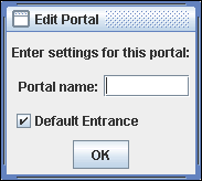
A default entrance portal is also required to save the island. To create this, click on the Create/Edit/Delete portal button (rightmost of the three Mode buttons, it's the yellow arrow), and then place it on the scene. Define the direction the arrow points by clicking to place the arrow and dragging in the desired direction. As it is an exit portal for the dock, place it so it faces towards the ocean or dock. Name it port, and check the Default Entrance box.
Resources
Most islands spawn a variety of commodities to support the ocean economy. This impacts what can be used when designing an island. For example, pretty herbs cannot be randomly used to decorate an area, because they may be an actual commodity, and their inclusion would improperly add to the island spawn. Even though there are many unassigned herb/mineral color combinations, it is best to not use them, so there is no chance of confusion or problems in the future.
Tips & Techniques
Render priority
When two objects or parts of objects are placed on the same tile, both overlapping objects will be marked with yellow boxes.
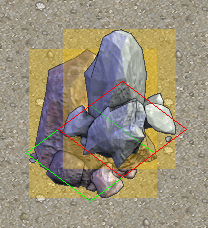
Even though this shouldn’t be used too often, two objects can be placed overlapping, if needed. To get rid of the yellow boxes, the render priority of the two objects needs to be adjusted.
Middle clicking an object - or left clicking, when the „?“ tool is selected - brings up a window.
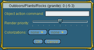
The slider in this window is used to change the object’s render priority. Overlapping objects with yellow boxes will normally have this slider at the same level. Giving one of the objects a higher or lower level of render priority than the other will make the yellow boxes disappear. The object with the higher render priority will always be displayed above or „in front of“ the one with the lower render priority.
In the example below the pumice rock on the left and the granite rock on the right share two tiles. The granite rock should appear to be behind the pumice rock. After lowering the granite‘s render priority (moving the slider from the middle, where it was in the beginning, to the left) and closing the window, the yellow boxes are gone and the granite sits behind the pumice as desired.

Almost all plant objects have their render priority slider in a middle position by default, so that placing plants on the same tile(s) will normally always create yellow boxes. An exception are the two scrubgrass types. These have a lower render priority by default, so that they can be placed as support (link) below plants easily.
Placing two overlapping objects and playing with render priority should be kept to a minimum and only be done when necessary, because it can get messy easily and the designer risks creating flickering tiles. There also should never be more than two objects sitting on the same tile.
Building natural islands
Building natural islands is what island designers are doing most of the time. Almost all islands for new oceans are built uncolonized, in their natural state. So besides limitations regarding size, commodities and basic technical requirements, there is also a restriction on which groundtiles and objects may be used.
Another thing to keep in mind is, that the island will be colonized in the future and it’s main purpose – besides looking great in its natural state – is to be turned into a home for players and a to serve as an easily usable base for other elements of the game.
In other words: Island designers try to create a beautiful and convincingly natural island with a layout, that allows easy and sensible future colonization.
An island designer usually starts out with information about the island’s size (link), which commodities (link) to use and a brief description to give him an idea what kind of island he should be making. It usually includes things like the climate region and basic characteristics, for example „a rocky ridge in a harsh, cold area“ or „a tropical paradise with lush inland forests and vast beaches“.
Scene name and type
(stuff)
The island must be named properly in the scene name box and the scene type must be set to „outdoor“ via the dropdown menu in the top right corner of the editor’s window.
Dock arrow placement
A dock arrow must be placed with the „arrow tool“. (pic) The dock arrow must be named „port“ (without the “s) and point out to sea. The box „default entrance“ must be checked. This is where the dock area ingame will be, so make sure you chose a reasonable spot for your docks.
Assuming that pirates normally don’t swim to an island, a rowboat is placed beside the dock arrow. It can be found in the object layer menu under outdoors-> props -> rowboat (beach).
(technical stuff)
The dock arrow is the place where pirates will step ashore ingame. It should be placed in a spot, that provides enough space for chat circles (within the limits of the island’s overall size, of course). Buildings cannot be placed within a 10 tiles square around the dock arrow, but having some of the buildable space close to the docks is advisable, so pirates don’t have to walk across the entire island to reach the other parts of the game.
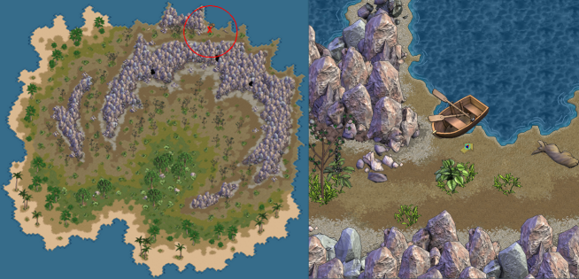
For example: the dock area in the image below is placed in a completely wrong spot. There is almost no space for chat circles beside the dock arrow. The buildable space is obviously on the opposite side of the rocks and too far away from the landing. Pirates would have to walk around the entire rock formation to reach the colonized part of the island.
The middle of the southern coast is a much better spot for the docks on this island. There is enough space for chat circles and a lot of commodity free, buildable space is only one screen away from the landing.
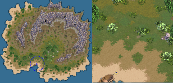
The dock area is the first part of the island a pirate will see. There’s nothing like a good first impression and designing the dock area with a little extra care is definitely worthwhile. For example a beach with bits of greenery, a few palm trees and variety in groundtiles will look more appealing, than seeing nothing but one large empty plain of sand.
Island size
Islands come in three different sizes – outpost, medium or large and each type of island must be able to fit a certain number of buildings. The overall landmass of an island is mainly determined by that.
Island sizes:
- Outpost: An outpost island must comfortably fit 2 buildings, a fort and a shoppe, nothing more. (example pic)
- Medium: A medium island must comfortably fit 12 buildings: five bazaars, a palace, an inn, a bank, an estate agent, one housing structure, one attraction, and a marketplace. (example pic)
- Large: A large island has no restriction on the possible number of buildings and should provide enough buildable space to comfortably fit a number of 30 to 37 buildings. (example pic)
Buildable Space
Generally, buildings can be placed everywhere on an island as long as there is enough ground to fit the building’s footprint. Governors can place buildings over almost all plants and rocks. But there are a few exceptions. Certain groundtiles and objects, can’t be built over and should be used with that fact in mind. Otherwise there may be much less buildable space than it seems on the first glance.
Buildings can not be placed on water, lava, bog and fissure groundtiles. In the object layer, pumice cliff tiles, herbs and minerals make it impossible to place buildings.
Buildings also can’t be placed within an square of 10 tiles around the dock arrow.
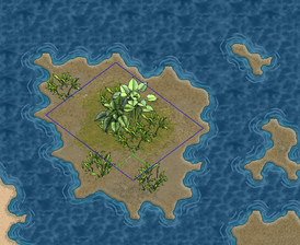
If an island's design includes smaller outlying islands in the waters close to the shore, the designer must pay close attention that these unreachable bits of land are too small to fit any buildings.
Little bits of land like the ones in the picture below are perfectly ok.
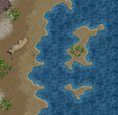
An outlying island like the one below is already too large, as it already fits the footprint of a small building.
Colonization check
The so called „colonization check“ is a way to make sure that your island provides the required space for buildings. To check if there is enough, too much or too little buildable space, simply place the required number of buildings in a reasonable way. Don’t just make sure they fit, but make sure they do fit comfortably. (example pics)
This check should be done at certain points during the design process, for example after finishing the basic shape and layout. Saving the colonization check for when the island is almost finished is not advisable. In case of a mistake, shape, layout and foliage may need to be changed and a lot of previously done detail work was for nothing.
(example pics)
Obviously buildable space
All islands, but especially large ones, should not only have the required buildable space. Parts of it should be areas of obviously buildable space, with preferably quite a bit of it around the docks.
Islands, which are completely dominated by rock formations or dense forest may look beautiful, but aren’t practical for ingame use. Parts of the island should be commodity free areas with rather sparsely placed foilage, to make a future governor’s job of placing buildings easier. The island’s layout should support the easy creation of a nice, well arranged town on it and not force governors to scatter buildings everywhere or make them struggle to find a spot for another structure.
This does definitely not mean that unnatural looking strips, patterns or squares for buildings should be laid out.
Governors are usually reluctant to build over objects (or at least larger groups of visually dominant objects) and will, of course, try to avoid destroying commodities when placing buildings, too. Commodity free areas are naturally more inviting for the placement of buildings, than spots, where placing a structure would destroy a part of the island’s resources. Normally a governor will be more likely to build on open grassland or an almost empty beach, where only low foliage, shrubbery or a few single trees grow, rather than plopping down a building in the middle of a dense forest or a large rock formation. With the dock area as a common meeting point, providing free space for chat circles and also areas for buildings close by is reasonable, in order to make the other elements of the game easily accessible from there.
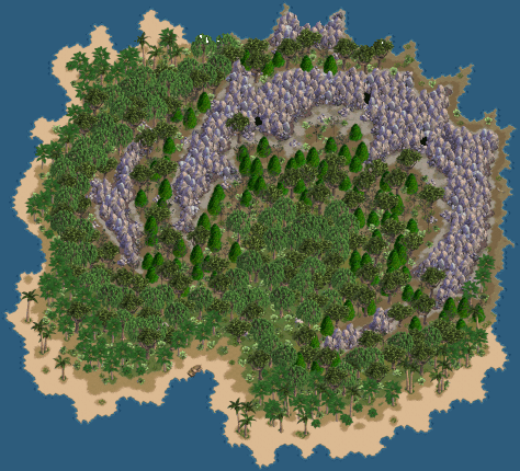
For example, a fully forested island with a large rock formation, like the one below is not usable.
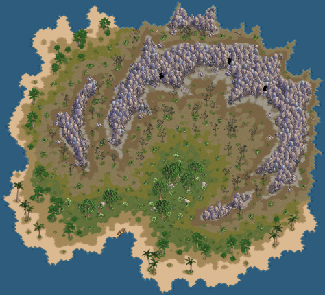
Despite the large rock formation, the island is perfectly usable with reduced foliage. It is much more accessible to colonization in the state shown below.
Forbidden/allowed objects and groundtiles
A natural island is assumed to be untouched by man. Because of that certain objects and groundtiles should not be used – put simply anything „man made“, both groundtiles and objects, are out of place on a natural island.
Groundtiles
Normally only the groundtiles from the „base layer ->outdoors -> beach“ and „base layer ->outdoors -> country“ menu are used for natural islands. Groundtiles from the Indoors, Adventure or Towne menu should not be used. There are even a few exceptions in the „country“ menu. Lava (crater), Fissure and Snow groundtiles shouldn’t be used unless this has been allowed specifically. Also the seawater tiles from the „beach“ shouldn’t be used. The seawater tile must be the default base tile, but shouldn’t be put into the scene manually.
Objects
Normally only objects from the object layer -> outdoors -> plants menu should be used in the object layer. Exceptions are the rowboat near the dock arrow, and a few others. Driftwood (object layer ->outdoors->props->driftwood), fish skeletons (object layer -> props -> misc -> fish skeleton) and turtles (object layer -> outdoors -> animals -> tortoise), may be placed as „natural“ decorations, but shouldn’t be used too often.
Rocks (snowy) and the snowy graphic of tree (fir) shouldn’t be used unless it has been allowed specifically.
There are also limitations on the use of certain plants – the ones which spawn commodities.
Commodities
Commodity Objects
Some objects in the Object layer ->Outdoors->Plants menu spawn commodities ingame. These objects are forbidden to use, except the ones that have been specifically assigned to the island.
Placing commodities
Basic commodities are being placed by simply putting the right type of plant or rock in the scene.
Minerals and herbs – also called rares – are placed by putting the according type of herb or mineral in the scene and then coloring it with the „?“ tool. Left clicking the placed object will bring up a window with a colorization dropdown menu, where the desired color can be chosen.
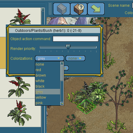
Do not color your herbs and minerals with the dropdown menu below the scene name box.
The exact number of commodities on an island can be checked by using the Commodity Objects count under „Actions“. This will bring up a window with the exact count of all basic commodities and colored rares currently placed on the island.
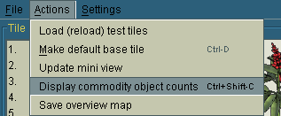
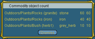
It’s advisable to color each single herb or mineral right after placing it. Uncolored rares do not show up in the commodity objects count and it’s easy to forget the exact position of every rare. That way the risk of losing track of how many are already placed or are still missing, is rather high.
Herbs and minerals must not be used as decorations, even if they have a color that doesn’t spawn a known commodity.
Basic commodities do not prevent a future governor from placing buildings,
but rare commodities can not be built over. Both types of commodities, but especially rares, should be placed in a way, that doesn't block too many potential building spots.
Walkability
Pirates cannot walk through any type of object and they can’t walk diagonally, they can only walk in straight lines from tile to tile.
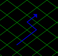
Each part of the island must be reachable by walking. No part of the island may be cut off.
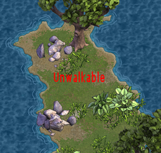
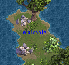
Pirates can walk on the edges between normally walkable groundtiles and the seawater default base tile. Only the tiles marked red in the picture below are not walkable - assuming that the water in the image is the default base tile.
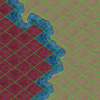
Because the edges of manually placed seawater tiles aren’t walkable, they may not be placed in the scene.
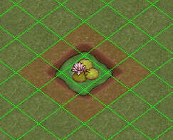
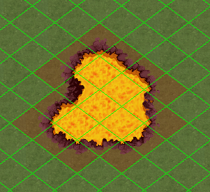
Certain groundtiles are not walkable. Pirates cannot walk on lava (crater), fissure, bog or water.
The edges of bog, lava (crater) and fissure aren’t walkable, too. That means placing for example one tile of bog makes 9 tiles unwalkable: the bog tile itself and the 8 tiles around it.
Checking for walkability:
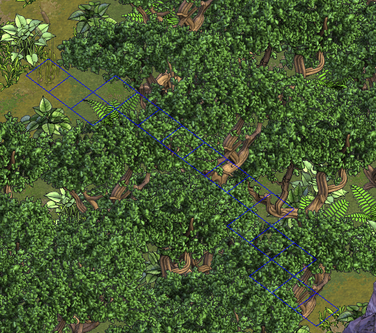
If only low foliage or just a few plants are placed on an island, it’s easy to see if all parts are walkable. Keeping forested areas walkable is a little more difficult, since trees are obscuring the ground, and one stray bush or piece of scrubgrass, hidden behind a tree’s leaves, can easily block a path without being noticed. One way to prevent this from happening is to pay close attention to what you place where from the start. (That should be done in any case, but the larger the island the harder it gets to keep track of these things.)
A method to double check for walkability in areas, where the groundtiles aren’t visible, is to select a one tile wide object like reeds or a piece of scrubgrass and start scrolling slowly over the scene. When hovering the cursor over a tile that‘s already blocked by a placed object, the surrounding square of the object on your cursor will highlight red, instead of the normal blue.
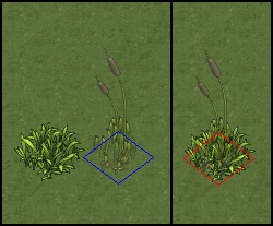
Now simply try to find connected „blue“ paths through the obscured part of the forest. Please note that this way only blocking objects can be found! Blocking groundtiles can not be detected this way.
Hiding of paths:
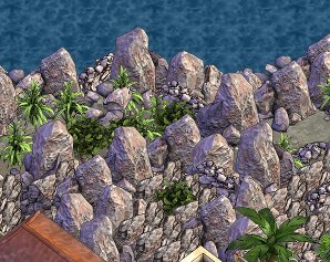
While we want to be able to walk as many places as reasonable, we don't always want those paths to be too obvious. An example of a too obvious path is shown here:
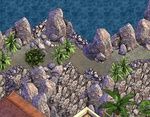
It can be obscured while remaining walkable with some effort:
Natural groundtiles
The Grid
The editor’s base layer is effectively nothing but square tiles, laid out in a symmetric raster.
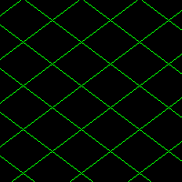
Naturally, placing groundtiles within this grid can easily result in artificially looking patterns and shapes, which reflect the underlying raster. But straight lines and right angles don’t really appear in nature, so one of the most important things to make an island look natural is to hide this underlying grid. The grid mainly becomes obvious on coastlines and on the edges between areas of different types of groundtiles. The examples below show, what an island’s groundtiles should not look like. (pics)
Natural islands shouldn’t have any obvious straight lines, stair steps, squares, etc..
Fringes
When two different types of groundtiles connect, a fringe is created. Depending on the types of groundtiles, a bit of one type of ground is spread onto the other type of groundtile. The marked groundtile here is actually dark sand, but bits of the thick grass beside it reach onto its tile.
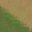
Different groundtiles fringe differently with others. Some are more or less dominant than others.
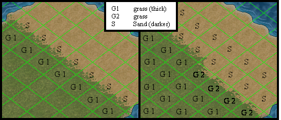
The thick grass (G1) is more dominant than the dark sand (S) and occupies a part of the adjacent dark sand's tile. But the dark sand is more dominant than the "plain" grass (G2) and occupies a part of the plain grasses tile.
These different "fringing priorities" can be used to hide the grid, to break straight lines in ground transitions and to create rounded, natural looking shapes. Put simply: the island designer needs to play with different types of groundtiles of the same color on the edges of groundtile areas.
Examples
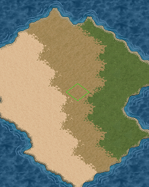
One might start by using three different tiles to achieve something like:
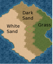
Start by smoothing out some of the boxiness, still using the original tiles:
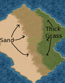
Once you've done as well as you can with those three, start filling in with some transition tiles:
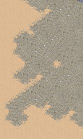
Another example of a non-ideal start:
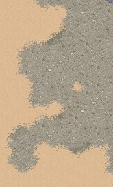
with an improved transition:
Fringing priorities
The following is a table of reference providing all of the ground tiles available in the editor. The table runs in order of most dominant, to least dominant. Therefore, the groundtile at the top of the table will fringe over all other tiles, and the groundtile at the bottom will be fringed over by all other tiles.
| Tile name |
|---|
| Fort |
| Snow |
| Fissure |
| Treasure |
| Jetty (front) / Jetty (back) /
Wood planks / Wood planks (opp) |
| Lava crater |
| Bog |
| Lava rock |
| Seawater |
| Beach (rocky) |
| Cobble (round) |
| Cobble (square) |
| Shale (cobble) |
| Cobble / Cobble (opp) |
| Cobble (brown) |
| Red stone |
| Dirt (bumpy) |
| Bushy |
| Mud (cracked) |
| Rock (dark) |
| Dirt (crusty) |
| Mud (grey) |
| Dirt (brown) |
| Grass (thick) |
| Grass (lite) |
| Rock (mossy) |
| Grass (patchy) |
| Dirt (stoney) |
| Sand (darker) |
| Beach (pebbly) |
| White sand |
| Sand |
| Rough dirt |
| Grass |
| Dirt |
| Brush |
| Solid rock / Dungeon |
Groundtile Groups
Variety within groundtile areas
Flicker
Flicker, also known as winking, is when two or more overlapping objects fight for placement priority, causing the objects to "wink" or "flicker" by trading visibility rights back and forth.
Causes of Flicker
The Basics
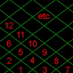
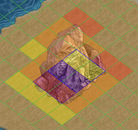
The grid in the Editor is written with preset priorities that work as shown in the picture on the right. These priorities are passed on to any placed objects, such that they share the priority assigned to the base square(s). This means that anything in the first row will cover the next row, even if the object in the next row is farther forward (1 covers 3, 4 covers 7, and so on). Trying to go against that essentially guarantees flicker. Going with it doesn't guarantee there will be no flicker, but it increases the chances.
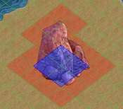
Objects have two distinct parts to consider -- the base (blue squares), which determines what priority the object is assigned, and the surrounding image (red squares). Because a rock's base is four squares, it has four simultaneous priorities, one for each of the squares it fills. Usually, this becomes a single average. Sometimes, depending on where and how other objects share a given square, and on how their averages compare, this average acts as though it has split into individual square-specific priorities again. The surrounding image, meanwhile, has no specifically associated square to give it a unique priority, so it takes the average priority of the base as its own.
When rendering occurs, it changes the priority of an object's base. However, this change does not carry over well to the image because of its lack of an associated square to enforce the priority change. This discrepancy between base and image priorities is the root of all flickering problems.
At-Risk Areas
When rendered correctly, two objects can usually overlap without any problem. Sometimes three objects can overlap without flickering, but it's rare. More than that, and something will flicker. There are also times when objects flicker because there is too much overlap in the vicinity, even if it's only several pairs of objects. In those cases, playing with rendering may fix it, but sometimes the only solution is to remove or redo the flickering section.
Usually, overlapping bases, rather than just overlapping images, are required for flickering to occur. If there are no overlapping bases and there's still flicker, cliff tiles are usually at fault, or sometimes a few leaves of a rain tree.
Color code for the picture to the right:
- Red is the first rock, base and image.
- Yellow is a new, overlapping, rendered rock.
- Orange is where the two images overlap, increasing the risk of flicker.
- Purple is where the two rocks share base tiles.
The two purple squares have the greatest risk of flickering, even though individually they would be two of four flicker-free squares. The middle yellow and red zones are the next most likely areas for flicker, followed by the orange areas, because of the unrendered average priority used by the images.
In the following pictures, the different shades of blue grid lines show the bases of the affected objects. The circles show where the object, currently flickering on top, is supposed to be below the other object.
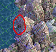
|
Notice how the flicker is between the base of one object and the images of both (equivalent of the above labelled middle yellow and orange zones). | 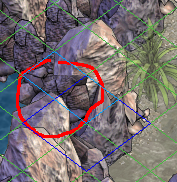
|
Notice how the flicker is where the two objects' bases overlap (equivalent of the purple zone) as well as between the base of one object and the image of the other. |
Guidelines
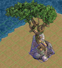
On the left:
Note: The tree should be rendered below the rock; above is only to make the base location obvious.
Assuming correct rendering, this is a fairly safe placement of a large singe-square object. The unrendered average priority of the rock is higher than that of the tree, so the images won't fight unless you try telling the tree to grow out of the front of the rock (as in the picture).
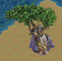
On the right:
This positioning is going to flicker regardless of rendering (Perhaps it would be safe if it were the only overlap in the entire scene, but overlaps tend to come in multiples...). Trying to hide the tree behind the rock will make the images fight, because the tree wants to be in front. Placing the tree in front, with roots growing out of solid stone, looks funny. It also flickers, for reasons unknown. The same frequently happens with scrubgrass placed in the front square of any 4-square object. Overlaping two low pumices on any corner/side also tends to cause flickering, often for no obvious logical reason, and almost as frequently it can be fixed by changing the rendering to what would seem to cause more flicker. And as a rule, the more overlap there is in any given area, the more flickers will result and need fixing.
Finding Flickers
In extreme cases, flickering will occur just by moving the mouse across the screen. Other times, placing an additional object will help locate flickers. Sometimes, scrolling to an entirely different part of the screen and back brings out more flickers. Any number of methods can be used to expose flickers; it just takes learning to watch for them to see them when they happen.
