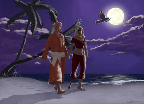
Salvia and Alemdar was created by Stimmhorn as a commissioned art piece.[1]
Notes from the Artist
Disclaimer: This is by no means a definitive technique or process, it's just one possible way of painting things. My technique often changes from painting to painting.
You are also probably not going to become better artists after reading this. There are no shortcuts in art; it takes years of practicing the fundamentals. The best advice I can give anyone is to draw from life, everyday.
Now, on to the tutorial.
Tools
- Adobe Photoshop 6.0
- ArtRage
- Tablet
- Reference photos (images.google.com)
Process

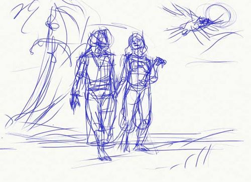
After discussing with Salvia what she wanted in this painting, I made a sketch in ArtRage. This is mostly to make sure the characters are in proportion and to work out the composition. The lines are nearly "illegible" because I end up painting over them anyway. If the painting has lots of different elements, I will use a different color for each one. This one was pretty straightforward, so I sketched everything in blue. For fun.

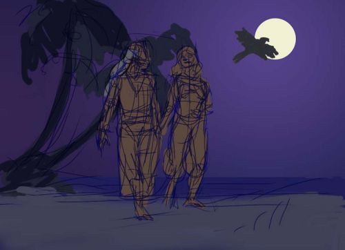
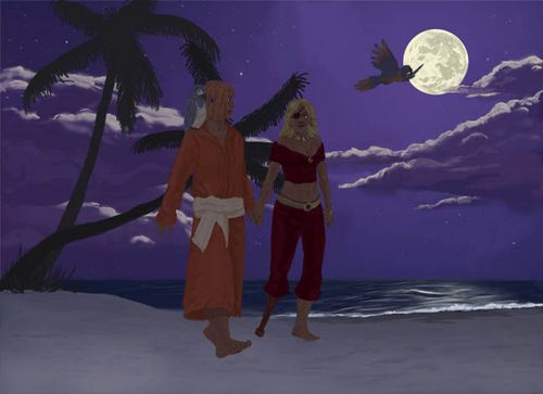
Next, I uploaded the sketch into Photoshop. Setting the lines on a multiply layer above everything else, I then took each element of the painting and made a silouhette of it on a new layer, in roughly the appropriate color (with a simple gradient for the background layer). At this stage there are separate layers for the background (sea and sky), the mid-ground (sand and trees), the characters, and the parrots. I will be adding more layers later on.
Notice that the parrots shifted around; I thought the image was unbalanced so I moved Salvia's parrot to Alemdar's shoulder (thus the advantage of having everything on a separate layer).

Now the lineart is hidden and the image's resolution changed from 72 PPI to 150. (This essentially doubles the size.)
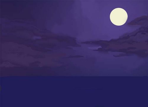
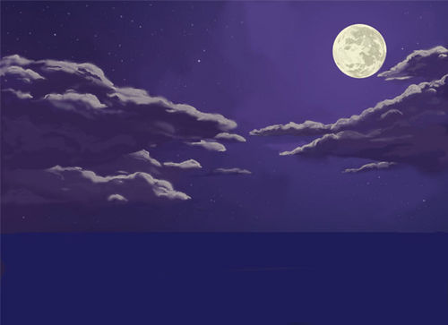
I hid every layer except the background. Then, with a large soft airbrush, I blocked in the general shapes of the clouds, using colors that are already in the sky gradient. I used several different colors for each cloud to give them some interesting variations. Then, with a smaller hard airbrush, I tightened up parts of the clouds to create contrast and focal points (looking at reference images helps here). I also used a large brush to paint over parts of the sky, because perfect gradients are boring.

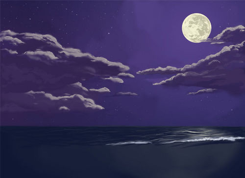
I then used generally smaller brushes to add moon-colored highlights to the rims of the clouds. The highlights were then partially blended into the clouds. To make the stars, I used a small star-shaped brush with spacing set to ~500% and scribbled all over the sky.

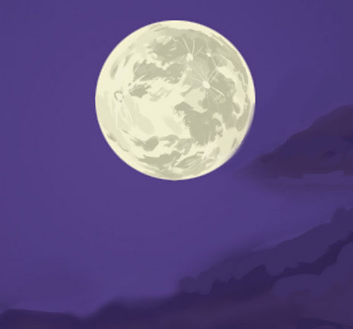
The moon also received detailing at this point (this is a 100% resolution shot). I used a small hard brush to render the surface (reference photo used for this part as well.) This is the level of detail that most of the painting will eventually receive.

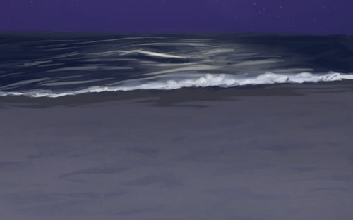
Selecting just the water, I used a very large soft brush to make a gradient from yellow to very dark blue. I then used a navy hard brush and horizontal strokes to create waves. The waves directly under the moon received yellow highlights (reflections) and were given more care because they would be a focal point. I briefly switched on the mid-ground layer to see where the shore would be, then I painted in some white foam there to represent lapping waves.

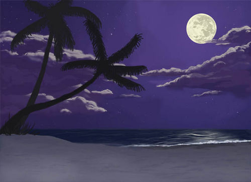
With the background finished, it was time to lock that layer and move on to the next one. The first step was to give the sand texture: With a large textured brush and a darkish blue color, I painted over the entire surface. Then, much like I did with the waves, I painted over the surface again with the original sand color, leaving some of the darker texture to represent small dunes.

I painted in the palm tree silouhettes, and the mid-ground was done (lighting would be added later).

I went back to the character layer and, after a preliminary anatomy sketch to make sure they were still in proportion, I repainted their outlines in the final base colors.
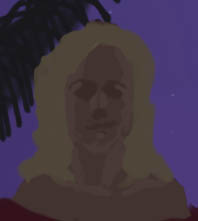
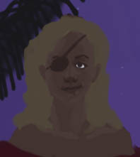
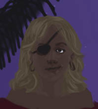
Now the fun part began. There is unfortunately no shortcut to rendering out realistic characters. Generally the strategy is to noodle away with a small brush until you're done rendering, but here's a small step-by-step of Salvia's face:

In the first image, I used a lighter color to split her face into 3 different planes.

Then I used darker colors to work out some details like the eyes and nose, and a soft brush to make her face look less angled.

After I noticed the the head was looking too small, I resized it and finished up the details with still darker colors.
At this point, the shading had to be subtle because the only light source in the painting is the moon. Only small variations in tone were used to add volume; darker colors were reserved for places where almost no reflected light would be (like in the nostrils).

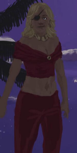
Here's another progress shot; I had just started on the lower torso. You can see the beginnings of folds in the clothing.
The next two hours or so were spent using the exact same technique to noodle away at the characters and parrots until they looked right. I really wish there were some super secret tricks of the trade to reveal here, but it's just experience and patience. References are a must for things that you are unfamiliar with drawing; I found some parrot photos online and used them to make the familiars look right.

This is what the image looked like afterwards.
Now onto the lighting:
I made a new layer set to 'screen' at about 70% opacity. Then, using various brushes, I painted in light blue where the moonlight would be hitting the character and mid-ground. In rounded areas where a lot of light would be falling, I used a large soft brush. In areas where the moon would be partially blocked (like, around the flying parrot), I used a small hard brush. I also erased parts of the highlight where a shadow would be cast, like on the sand.

After about an hour of highlighting, The image looked like this. All that was left was to add a slight glow around the moon, and my signature :)
Other Links
