Talk:The Guild of the Eagle/banner
From YPPedia
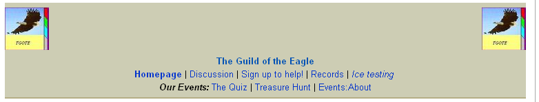
Image placement
I don't know what browser you're using, but on Firefox, putting the images lower down makes the banner take up more space, and the way the images overhang the edge of the div box just makes it look weird. --Belthazar451 03:57, 28 June 2008 (PDT)
- I use IE and it looks like this:
 in IE. May I see how it looks like on your browser? Hope we can fix this problem soon.--HeadofTGOTE 09:25, 28 June 2008 (PDT)
- A banner such as this would probably be easier to display using a table. That way this image issue would be easier to fix. The screenshot you provided is the same as what I see - and it doesn't look too great. --Sagacious (talk) 09:34, 28 June 2008 (PDT)
- Aye, that's pretty much what I see too. When I put the images up above the text, they were properly contained within the banner, and they didn't make the banner any bigger anyway. --Belthazar451 16:02, 28 June 2008 (PDT)
- Yarrr, I'm so sure how to explain it but this is how it looked like when ye edited it:
- It takes up more space in IE that way. >.> Hope there's a way to make it look good it all browsers. =) --HeadofTGOTE 10:12, 29 June 2008 (PDT)
- Aye, I can see what you mean. On Firefox, it displays how you probably intended, with the two images in line with the text. The way to get it to look good on all browsers is to go with Sagacious' suggestion above and use a table. To demonstrate, I've re-done the page - I tested it in IE, and it looks fine. --Belthazar451 16:27, 29 June 2008 (PDT)
- Arr, it's working well for my browser too now. Hopefully it works for other browsers other than IE and FireFox as well. Problem solved! =) --HeadofTGOTE 23:41, 30 June 2008 (PDT)
- Aye, I can see what you mean. On Firefox, it displays how you probably intended, with the two images in line with the text. The way to get it to look good on all browsers is to go with Sagacious' suggestion above and use a table. To demonstrate, I've re-done the page - I tested it in IE, and it looks fine. --Belthazar451 16:27, 29 June 2008 (PDT)
- It takes up more space in IE that way. >.> Hope there's a way to make it look good it all browsers. =) --HeadofTGOTE 10:12, 29 June 2008 (PDT)
- Yarrr, I'm so sure how to explain it but this is how it looked like when ye edited it:
- Aye, that's pretty much what I see too. When I put the images up above the text, they were properly contained within the banner, and they didn't make the banner any bigger anyway. --Belthazar451 16:02, 28 June 2008 (PDT)
- A banner such as this would probably be easier to display using a table. That way this image issue would be easier to fix. The screenshot you provided is the same as what I see - and it doesn't look too great. --Sagacious (talk) 09:34, 28 June 2008 (PDT)
